


If you’re curious to see how these insights and solutions came to life,
be sure to check out the Final Design in Figma. It showcases the full user experience from PUMA redesign. Explore the interactions,
flows, and modern visuals that bring everything to life.
My Role
UX/UI Designer
Researcher
Tools Used
Figma, Zoom, AI Data
Project Type
Web Redesign
Overview
is known worldwide for energy, movement, and bold identity, yet its original homepage didn’t fully communicate that vibrancy. When I began this redesign, my goal was to amplify Puma’s brand personality while solving key usability issues: cluttered layout, low product visibility, and unclear navigation paths. The final result is a homepage that feels energetic, structured, and intentional, guiding users straight to what they care about most.

Problem
The original Puma homepage lacked a clear visual hierarchy and buried its collab products beneath layers of unfocused content. As a result, users miss out on PUMA’s most fashionable content. When evaluating the existing PUMA’s UX/UI, some challenges stood out:
• Minimal product exposure. Users had to search for PUMA Collabs and other items considerably.
• Flat UI hierarchy. Important categories were buried, making it harder to explore men’s, women’s, and kids’ products.
• A lack of visual energy. Puma’s brand thrives on boldness, but the page felt muted and inconsistent.
Solution
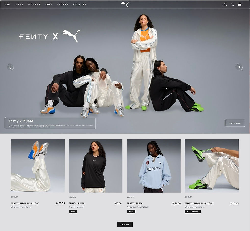
1. Vibrant, brand-aligned header with a strong visual anchor, instantly conveying Puma’s creative attitude and helping users identify products, collaborations, categories, or campaigns.
2. Product carousel near the top of the page, allowing users to see new arrivals, explore Puma’s top collabs, and start shopping without scrolling through dense content, creating momentum and echoing Puma’s brand ethos.
3. Dedicated gender/child-specific product sections with bold sub-headers, lifestyle images, and quick-access links to related product collections, providing clarity and helping users find their way without cognitive effort, especially families.
Design Strategy
Methodology
I approached the redesign with a simple guiding statement:
“Deliver Puma’s bold personality through a clean UI that showcases products early and clearly.”
This meant improving visual hierarchy, energizing the layout, and making the page feel more modern and instantly shoppable.
Online Accessibility-Testing Tools
Resource tools to measure websites accessibility levels
Tool/ Resource
What it does / Why it’s useful
WAVE Web Accessibility Evaluation Tool
Accesstive Free Audit
Siteimprove Accessibility Checker
Dock WCAG Accessibility Checker
Lets you enter a page URL (or use a browser extension) to run a quick accessibility evaluation and highlights many accessibility & WCAG issues directly on the page.
Simple, fast, no-signup-needed scan: you input a URL and get a report showing major accessibility barriers, with a user-friendly summary.
Performs a per-page audit, producing a score and detailed issues report — good if you want to combine accessibility, SEO, and content quality checks.
Online WCAG checker: checks structural and code issues (headings, alt text, markup validity etc.), supports automated auditing and also offers monitoring over time.
Competitive Analysis
Feature comparison across major competitors
Homepage Features

NIKE

Adidas

New Balance
Competitor Type
Direct
Direct
Direct
Interactive Header
Interactive Banner
Product Cards
Category Section
Homepage Product Pricing
Accessibility
Market Share
60%
35%
5%
Interview
Interview Conclusions
Interviews were conducted in person and via Zoom with four participants ages ranging from 13-42 with different economic backgrounds. The interview topics included:
(1) Have you ever used a website to purchase clothes or accessories? What was that experience like? (2) Have you ever had any negative experiences using a e-commerce site? If so what was the experience?(3) What visual aspects makes a website stand out to you?
(4) Can you walk me through how you navigate e-commerce websites?
1
Participants wanted a simple & fast experience with appealing visuals
Participants expect faster and easier then shopping in person
2
Participants become frustrated when not able to locate certain products
Participants get confused when images & components aren’t interactive
3
Participants gravitate towards life size imagery & visual components
Participants find carousels that showcase products helpful & appealing
4
Participants expect a standard user flow after charting items
Participants find themselves backtracking to find items
AFFINITY MAP
Following the interviews, I meticulously reviewed the recordings, identifying significant insights to discern the aspects of the
questions that deeply resonated with the participants. Additionally, I categorized their responses to develop a clearer understanding of their focal points.
Experience on e-commerce Sites
“I do not have time to search and dig for everything”
.
“I like seeing products right away and being able to add them to my chart”
.
“I like when a site is quick yet simple”
.
E-commerce Frustration
“I get confused when there are large images on the site but no way to interact”
.
“Small distorted images, make it hard for me to shop”
.
“With my eyesight, I need things easy to find and locate”
.
Benefits of visual Design
“I expect decent visuals on Big company websites”
.
“A beautiful website helps me trust the quality of the company”
.
Add cohesive visual components
.
“I'm more likely to use a website to shop if it's visually pleasing”
.
E-commerce workflow
“I expect traditional options like add to cart and buy now...”
.
“E-commerce site should be easy to navigate through”
.
“I usually expect products to be for in center and easy to click and browse with..”
.
Time Management When Shopping
Users want a common user flow and features that make shopping faster.
Hard To Find Products
Users want easy to find products,
Products and pricing should be front and center and easy for customers to add to their cart.
Bad Visual
Experience
Customers want a good visual experience that's stylish yet comprehensive,
Confusing
User Flow
Users expect add to cart buttons, pricing, and other features Commonly found on e-commerce websites
PAIN POINTS
PAIN POINTS
Time Management When Shopping
Users want a common user flow and features that make shopping faster.
Hard To Find Products
Users want easy to find products,
Products and pricing should be front and center and easy for customers to add to their cart.
Bad Visual
Experience
Customers want a good visual experience that's stylish yet comprehensive,
Users expect add to cart buttons, pricing, and other features Commonly found on e-commerce websites
PERSONAS
Personas created based on patterns identified during user interviews, affinity mapping, and review of pain points. Personas represent common roles Athletes, women, children, and men. These personas helped guide design decisions by highlighting user goals, user needs.

Name: Bridget
Age: 19
Location: Boston, Massachusetts
Occupation: College Student
I love to run, and this year I want to run the Boston Marathon, so I need to spend more time training and less time shopping.
— Bridget
Goals
Quickly find quality items online
Find the best running shoes at the best price
Find stylish running gear
Motivations
Having a fun yet stylish look for training and marathons
Having the right accessories for a productive run
Win the Boston Marathon
Frustrations
Unable to find all necessary gear for running
Unable to find stylish, running shoes
Wants to find the most affordable Puma shoes for running
Bridget, a 19-year-old Boston College student, and an avid marathon runner who prioritizes performance and style in her running gear. She shops online between classes for modern, comfortable, and stylish running gear. Bridget is looking for a seamless shopping experience, allowing her to compare products, discover new releases, and make informed purchases.
Bio

Buying the wrong clothes for school can be social suicide... my mom needs a easy way to shop.
— David
Goals
Purchasing a new pair of shoes for school
Having a quick easy way for his mother to shop online
Finding clothes that are stylish yet school appropriate
Motivations
Having a outfit that stands out amongst his classmates
Having a shopping experience that his parents comprehend
Finding a good pair of shoes for activities
Frustrations
Needing a easy shopping experience for none tech savvy parents.
Unable to find color appropriate clothes for school
Needs several option for kids
David, a 13-year-old middle schooler, is starting to care about his personal style and wants comfortable, trendy clothes for school. His none tech-savvy mother finds online shopping overwhelming, making it difficult to browse and buy efficiently. They’re looking for a simple, fast, and easy-to-use shopping experience to find quality clothing without confusion.
Bio
Name: David
Age: 13
Location: Fort Worth, Texas
Occupation: Student

I love my job at the resort; skiing and snowboarding are my passion, so I need gear that looks good and can keep up with me.
— Marshall
Goals
Buying a winter coat that looks stylish, but keeps him warm.
Fast and easy online shopping
Wanting to search different winter sports gear at various prices.
Motivations
Having a coat that keeps up with the weather at the ski resort.
Spending less time shopping and more time teaching
Having winter gear that matches
Being unable to find good winter jackets for a decent price
Unable to find decent looking matching winter gear
Doesn't like a slow shopping experience
Frustrations
Marshall is a 29-year-old ski instructor living in Denver, Colorado, who spends most of his days outdoors teaching on the mountain in extreme winter conditions. With long hours in snow, wind, and shifting temperatures, he’s actively searching for a durable, high-performance winter jacket that can keep him warm without restricting movement.
Bio
Name: Marshall
Age: 29
Location: Denver, Colorado
Occupation: Ski Instructor
DIGITAL WIREFRAMES
By analyzing user interviews, affinity mapping, and personas, I translated fundamental user requirements into a well-defined digital wireframe. Each section prioritized a modern, user-friendly navigation with the target audience in mind. This approach ensured user objectives and challenges were prominent throughout design.


After finalizing the digital wireframes, I used them as the foundation to build a prototype that users could interact with. This prototype focused on structure, flow, and functionality as well as visual design, allowing me to test how users navigate key tasks and how they react to the visual changes.
TEST
METHODOLOGY
After completing the wireframes, I created a low-fidelity clickable prototype to test the layout, flow, and content hierarchy. I conducted remote usability tests over Zoom, where participants shared their screens and interacted with the prototype. I guided them through the session, asking them to scroll down the homepage, hover over key elements, and verbally share their thoughts. The goal was to observe user progression, section identification, and interpretation of product cards, category headers, and interactive elements. Each session was recorded for analysis and affinity mapping.
RESEARCH GOALS
Goals for conducting usability test:
Evaluate whether users can easily understand the homepage structure and visual hierarchy.
Determine if the layout supports natural scrolling and intuitive exploration.
Identify any confusion around interactive elements such as product cards or category tiles.
Assess how well early content communicates product offerings and category divisions.
Observe whether users can navigate the page without prompting or additional clarifications.
USER TASKS
The participants were asked to:
As you scroll through the page, tell me what sections you notice and what you think each one represents.
Can you identify where you would go to browse products for your category (men, women, or kids)?
Which elements on this page feel clickable or interactive to you?
Do you feel any section is unclear, confusing, or out of place as you move down the page?
Based on what you see, where would you go next if you wanted to continue shopping?
UX/UI Redesign Changes
Visual breakdown of the UX/UI before and after

BEFORE
AFTER


BEFORE
AFTER


BEFORE
AFTER

BEFORE
AFTER

USABILITY TEST RESULTS
After completing the usability test, I organized all participant feedback into an affinity map to identify patterns and common themes. I grouped similar comments and observations into categories such as navigation, labeling, invoice creation, and user expectations. This method helped clarify which issues were most frequent and where users experienced confusion or success. The affinity map became a valuable tool for guiding design improvements and prioritizing the next steps in the app’s development.
Key Insights Summary
Primary Issues
User Successes
Recommendations
Low Value
High Value
Important
Less Important
Prioritization
Low Value
High Value
Important
Less Important
Create a category section for women, men and kids.
.
Create sections for Puma collabs & special items
.
Create a more consistent UI from page to page.
.
Add a modern glass look to the homepage Components
.
Add product cards for a more aesthetic look & a faster experience
.
Add a product carousel to the header for fast add to chart feature.
.
UX Improvements Analysis
Visual breakdown of key enhancements for Puma's digital experience
Vibrant Brand-Aligned Header

NEW
MENS
WOMENS
KIDS
SPORTS
COLLABS
Product Carousel Positioning


Specific Product Sections (Men,Women,Kids)

95%
88%
76%
Product Cards

UI Kit
Logos, Colors, Typography, & Components

HIGH-FIDELITY PROTOTYPE
Based on insights from the usability study, I used the feedback to refine the overall user experience and build a high-fidelity prototype. The process focused on improving clarity, simplifying navigation, and aligning the design more closely with user expectations. By translating what we learned into more thoughtful interactions and workflows, the high-fidelity prototype provided a more complete and realistic version of the product for testing and feedback.
Final Design
High-Fidelity Prototype

REFLECTION
WHAT I LEARNED
User testing exposed blind spots in the design process.
This project reinforced the importance of pairing aesthetics with usability. Puma’s brand thrives on motion, color, and attitude. By bringing those traits into a clean and structured UI, I was able to create a homepage that not only looks more like Puma but also works better for the people who shop there. The result is a shopping experience that feels lively, intuitive, and unmistakably on-brand.
Learning Through Exploration.
This case study taught me how essential it is to balance bold visuals with simple, intuitive usability. User feedback and affinity mapping revealed key accessibility needs and helped shape a design that works for a wide range of shoppers. Overall, the project reinforced that strong UX comes from listening to users and making their journey as clear and effortless as possible.

INVO
Mobile App

LIFTUP
Mobile App